The Importance Of Colour In Label Printing
By Ian Renton | Colours for Labels | 21 Jan 2016 |
The Importance Of Colour In Label Printing
Ian Renton | 21/01/2016 | Colours for Labels
Most companies involved in label printing will print your labels in colour but will not assist you with colour choices. It is not their job. They are printers, not designers. In fact, many label designs are prepared by outsourced graphic designers.
My company is a little different because I employ full-time and casual graphic designers to prepare artwork for our own labels and other printed products. Most of us know the basics of colour. We make decisions based on colour every day. We match colours in our clothing. We choose colours for our walls at home and for the car we drive. What do colours mean? To research this topic, I went back to my father's book, Enjoy Your Debt Collection published in 1996.
We still use these ideas in the design of our accounts stickers, Christmas stickers and thank you stickers. Red is a stimulating colour. Red raises the blood pressure. Red symbolises anger and danger so it is most often used with warning labels such as flammable liquid. It is also used for stop signs. Red is a hot colour whilst yellow is a warm colour. Yellow is not as aggressive as red but is still somewhat forceful. The third stimulating colour is orange. While weaker than red or yellow, it is still a stimulating colour. Hence, a number of road signs such as 'slippery when wet' are in orange or yellow.
Blue and green are comfortable colours and are used to reassure people. Blue is the colour of the sky and represents serenity and eternity. It is also the colour of loyalty, hence the expression, true blue. Green is the colour of the grasslands and the forests and signifies growth, light and hope. Purple is the colour of dignity and conservatism but also sadness. White represents light, innocence and purity. Hence, wedding dresses are usually white.
Black is a formal colour and is symbolised by a black tie event, the most formal of occasions. Black has dignity and can also represent the power of darkness. It is also the principle colour of mourning. It also represents defilement or error. Hence, the expression, black mark.
The above ideas from Jack Renton are still relevant today. For a more recent article on colour and how it relates to business, you can click on the link below. http://www.fastcompany.com/3028378/leadership-now/what-your-logos-color-says-about-your-company-infographic#
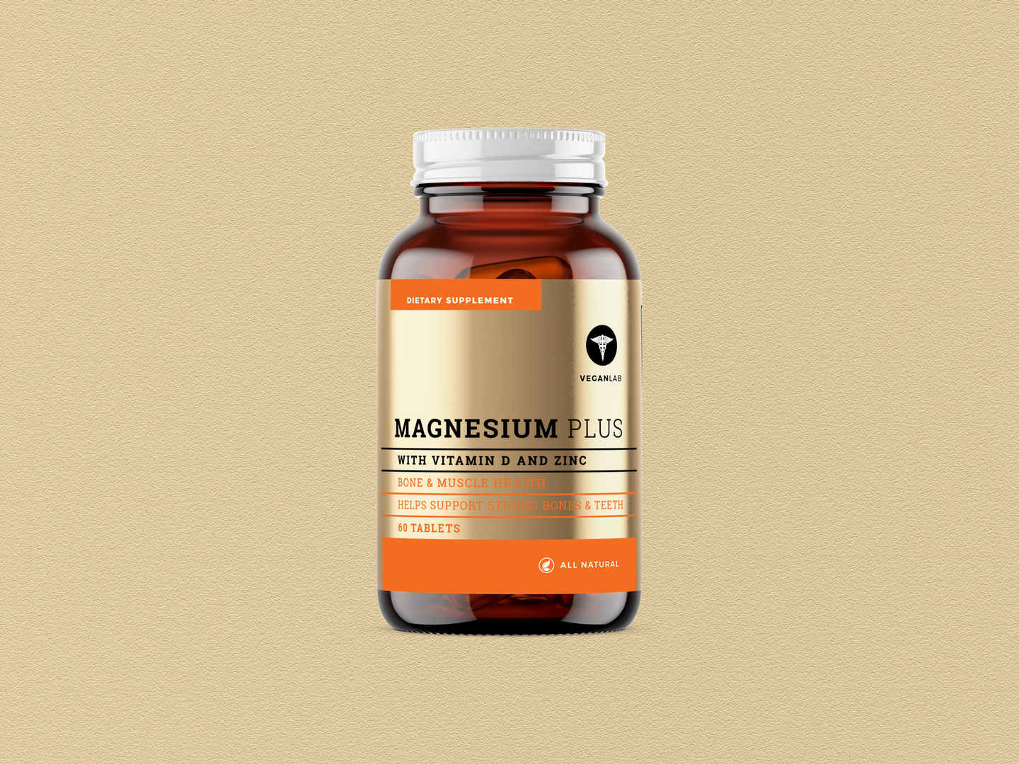
By all means, use the above ideas in label printing, logo creation and in your marketing. When it comes to label printing, most likely, you will want to combine colours. As a label printing expert from the 1960s through to the 1990s, Jack Renton makes the following suggestions. Purple, used with its opposite colour, orange, can be very bright, the contrast quite striking. For a very soothing effect, complementary colours are used. You can observe this effect by looking at a rainbow where closely related colours are adjacent. Examples are yellow and green. In a similar way, blue and violet merge into each other.
The challenge for you is to adapt these ideas into your product labels and other forms of label printing.
Recent
-
Top Trends in Wine Label Design for 2025
13 Feb 2025 -
Rentons Anti-Spike Drink Covers vs. Other Alcohol Promotional Merchandise
13 Jan 2025 -
The Benefits of Using Rentons’ Premium Wine Labels for Your Brand
18 Dec 2024 -
How You Can Achieves Affordable Luxury with Multi-Coloured Foil?
6 Dec 2024 -
Enhancing Safety and Brand Visibility with Drink Covers
2 Dec 2024 -
Drink Covers: Proactive Solution to Drink Spiking Crisis
5 Jun 2024 -
Premium vs. Traditional Wine Labels: Comprehensive Comparison
10 Jan 2024 -
Rentons Labels: Luxurious, Cost-Effective Wine Labeling
30 Nov 2023 -
Waterproof Labels - Do you need them for your products? | Rentons Labels
3 Apr 2023 -
Custom labels with typography that wows
20 Mar 2023
Categories
- Bakery Labels
- Barcodes
- Blog
- Bottle Labels
- Candle Labels
- Charity Labels
- Chocolate Labels
- Christmas Labels
- Clear Labels
- Colours for Labels
- Cosmetic Labels
- Digital Label Printing
- Egg Labels
- Essential Oil Labels
- Event Labels
- Food Labels
- Freezer Labels
- General
- Hand Sanitiser Label
- Honey Labels
- Jam Labels
- Jar Labels
- Label Design Tips
- Label Material Types
- Label Printing - General Knowledge
- Label Printing - Miscellaneous
- Label Printing Processes
- Label Stocks
- Labelling Laws
- Lamination For Label Printing
- Machinery for Label Printing
- Marketing Labels
- Marketing Your Food Products
- Microwave Labels
- Olive Oil Labels
- Packaging Labels
- Prices of Printed Labels
- Product Labels
- Trends in Label Printing
- Uncategorized
- Valentine's Day Labels
- Vinyl Labels
- Warning Labels
- Wedding Labels
- Wine Labels
Rentons Labels is a Sydney based Label printing company who offer custom label printing solutions. They specialise in packaging labels, wine labels, and beverage labels and produce all their labels in Australia.
Suite 1, Unit 3, 2 Burrows Road South
St Peters NSW 2044 Australia
Phone: (02) 9160 4511
Email: info@rentonslabels.com.au
Our Solutions
Helpful Links


